Note: This was originally published on 25 October 2009 on the Carbon Quilt blog (now defunct)
Augmented Reality used to be expensive to do but now the essential components of an AR system are routinely built into consumer electronics. Smart phones have GPS, compasses and accelerometers and AR is accessible to every developer, which is marvellous. There are already some inspiring applications such as Acrossair’s Nearest Tube. And Nearest Tube is surprisingly nice to use, by the way – AR is no longer just for geeks. Here’s a nice collection of AR videos: http://bit.ly/AR-vids.
But AR’s essential components can be used for more than merely augmenting reality (for an account of this see A history of the future of computing: why AR is where it’s at). One of the most exciting opportunities for AR comes from turning it on its head. Instead of adding a layer of data to the real world, use the real world itself as a 'canvas' for data. We at Carbon Visuals have taken to calling this 'reality augmented data' or RAD.
A simple example of RAD in action is www.carbonquilt.org. We take a datum such as a country’s per-capita carbon dioxide emissions and display it as an actual volume on a user’s own street, so he or she can relate to it physically and personally. Users have rich relationship with the buildings and geography of their neighbourhood and Carbon Quilt makes this is available to them for making sense of abstract statistics (literally making sense of them). We are currently working on an iPhone app. that makes the connection even stronger.
A basic illustration of RAD. Central Bedfordshire Council emitted 33,702 tonnes of carbon dioxide in 2008/9 (not including social housing stock). The council aims to reduce that figure by 60% by 2020. The illustration shows the actual size of this reduction in terms of volume of gas. Embedding the illustration in a map of Bedford (the nearest town) gives the unweildy volume a familiar context. Viewers' rich, embodied experience of Bedford helps turn the statistic into something personally meaningful.
Here’s the thing about AR: humans are already pretty good at making sense of the real world, but we are still rubbish at making sense of information such as statistics. It is often useful to add a layer of data to the real world, as Nearest Tube demonstrates. Nevertheless, the world is infinitely richer than any layer of data we could add to it. Data, on the other hand, is impoverished and our access to it clumsy. RAD lets us ‘borrow’ the world itself to provide a better interface with data.
This idea of borrowing aspects of world itself to visualise abstract data is not new in scientific visualisation. Philip Robertson mapped it out explicitly in an account of what called the ‘natural scene paradigm’ (Robertson, Philip K. 1991 May, ‘A Methodology For Choosing Data Representations’, IEEE Computer Graphics and Applications, pp 56 67, p 59). But up to now, scientific visualisation has aimed only to make data look like the world (e.g. make an undulating iso-surface look like a mountain, because we are good at looking at mountains and working out what we are looking at with a single glance). RAD goes much further in embedding data in the world itself.
Billions of years of programming (i.e. evolution) have given us a remarkable interface with the real world, much more powerful than any data interface we’ve built. With RAD, our rich experience of the world is co-opted to help us engage with data. This means our relationship with data could be as rich as our engagement with the real world (potentially).
Visual art has the power to inspire, provoke and fascinate. I know some incredibly talented artists that focus on scientific subjects, and I think their work is a beautiful and valuable science communication tool – but I'm having a hard time quantifying that value.
First off, I think it is worth distinguishing art inspired by science from artistic science communication. In my own work I do each – make art, and communicate science – and I have found that is important to be clear in my own mind which mode I’m working in, even when I employ the same techniques in both. Art (even art that is not inspired by science) has a significant role to play in science communication, but its role can't really be compared with that of ‘pedagogical science communication’ (communication that sets out to explain science).
The difference between sciencey art and artistic sci-com
One way to decide if something is art or artistic sci-com is to ask of it, 'how much scope is there to make this meaningful?'. Consider, for instance, an installation in a science museum. How could we decide if it is art or sci-com? A sci-com exhibit will generally set out to isolate an individual phenomenon and display it as clearly as possible, anchoring it to the ‘correct’ interpretation. Also, when designing a science exhibit you want its purpose to be unambiguous, because ambiguity would get in the way of viewers/users making sense of the phenomenon.
On the other hand, if the exhibit is ‘art’ then the need to anchor and constrain its purpose and interpretation is far less pressing. Indeed the opposite imperative applies: in general, the aim is to keep it ‘open’, not close it down. You want to leave plenty of room for viewers to make it meaningful for themselves. In pedagogic science communication you usually don’t want to give viewers this freedom, because it increases the risk of confusion.
Here’s an example: in the past week I have been working on an interactive exhibit for a science centre that explains transits and eclipses. It’s a subject that causes a lot of confusion and I’ve been working hard to ensure that what a visitor gets from the exhibit is precisely what I want them to get from it, because scope for interpretation is also scope for confusion. In another context I designed a kinetic sculpture called ‘Sun/Moon/Tide’ that addresses some of the same issues of the Sun, Earth, Moon system but not didactically (It includes a pair of divider callipers that indicate the positions of the Sun and the Moon and the angle between them). I would expect Sun/Moon/Tide to help viewers to understand the Moon’s orbit, but I wouldn’t count on it. The motivation for the sculpture is to draw attention to the astronomical rhythms in a way that viewers can make sense of them for themselves.
Scientific accounts are impoverished in the sense that they are silent about many of the things about the Sun, Moon and the tides that are important to us, for instance the way a landscape feels different in moonlight compared to daylight. (Nevertheless, accounts of the Sun, Moon and tides that are devoid of science are even more impoverished.) The sculpture may inspire some viewers to seek accessible accounts of celestial dynamics – it would be nice if it does – but its main job is foster an authentic relationship with astronomical phenomena, not merely to understand the science.
I have written more about the difference between art and sci-com and described an early version of Sun/Moon/Tide in an article in Leonardo:Oct. 2005 ‘Belonging to the Universe’ Leonardo Vol. 38, No. 5. The general point is this: the question, 'how much scope is there to make this meaningful?' can help distinguish art from sci-com. The example of an installation in a science museum applies to any other science related communication.
Here’s where the gets tricky from a semantic point of view. I’m making a distinction between art and sci-com (and suggesting a way of telling one from the other) but I would also argue that art has a role in science communication. Sometimes it is less important to get a message across and more important to open a subject up. From the point of view of the target audience, sometimes it is less important to ‘understand’ and more important to find a new perspective. I could make a point about ‘engagement’ here and how an artistic ethos may be more appropriate when attempting to foster genuine dialogue, but that’s rather more complex point to argue.
Quantifying the value of art to sci-com
So how should we respond to the problem raised by Matt Shipman: how can we quantify the value of art to sci-com? My answer is: don’t try to quantify it, find another way to assess it. Art does not lend itself to the kind of analysis that seems to work well for pedagogical science communication. It sometimes comes as a shock to sciencey types (a category in which I include myself) that it is possible at all to assess value without measuring anything. Nevertheless, it is possible and important, because unless you can find a way to assess it, the value of art and many other things besides will remain invisible to the sci-com community.
At this point science communication professionals may be wondering, ‘how do you assess the value of something when there is nothing to be measured?’ I’m not going to answer that question here other than to point out that it will be difficult for some people in the sci-com community because the way they conceive communication is so limiting. (I discussed the limitations of the ‘dominant view’ of popular science in the introduction to my PhD thesis, though that feels like a long time ago now.)
Matt Shipman says,
I began by going through the literature, with the goal of getting some numbers about how effective art can be when it comes to science communication. Why? Because good art isn’t free. You need solid numbers to make an argument for an art budget.
If that’s true it’s a shame, because anything you find to measure relating to an audience’s engagement with art (anything that gives you ‘solid numbers’) is not going to tell you a whole lot about it, and it’s sure to miss the most important aspects of it. It’s not epidemiology!
There are two main schools of thought in communication theory: one conceives communication as the way in which messages are transmitted, the other as the way in which meaning is created. Discussion within the sci-com community draws pretty much without exception on the first way of conceiving communication, which is much more amenable to quantitative analysis. The bias is understandable (studying the transmission of messages and their effects seems more ‘scientific’) but it is unfortunate because it misses much if not most of what happens when an audience engages with a ‘text’. When the text is an artwork, analysis of the first type is so strained it is practically meaningless. (Again, there is more discussion of communication theory as it applies to science communication in the introduction to myPhD thesis.)
In conclusion: if you want to understand the value of art in science communication, first think about the way you assess its value. The very idea of 'effective communication' may not be (analytically) up to scratch.
This is a map of the air that Felix Baumgarner fell through on 14 October 2012. The colour is mapped to the actual density of air. Spots show actual spacing of molecules that make up air (if the molecules were that size, they would be that far apart at that height).
One of the cool things about visualisation is that it's abstract. It means we can use the same visual techniques to make sense of very different phenomena. But sometimes it behoves us to know what things are actually 'like'. The Gulf oil spill, for instance: how much is 4.9 million barrels, really? What is 7 billion people like? How big is my carbon footprint? And what's the difference between knowing this as a number and seeing it as a volume of carbon dioxide gas? How curved is the Earth? I want to see the curvature for myself.
This post is a quick attempt to define 'concrete visualisation', which ultimately resorts to 'ostensive definition' (pointing at something and saying: "There. That's it. That's what I mean.") so feel free to scroll down and just look at the pictures. First though, just how curved is the Earth?
Tangent: an animated sketch of a piece of 'land art' that reveals the curvature of the Earth from the ground. The car is travelling at 130 km/h (80 mph) The road is not straight - it curves around surface of the Earth. The line of circles is a straight line - a tangent that touches the Earth's surface at one point. A tangent plane constructed from an array of buoys in a lake is also planned.
The many advantages of abstraction sometimes make it difficult to appreciate the value of 'knowing what something is like'. The ingeneous innovation in data visualisation we've seen in the past decade or so makes it even harder. Nevertheless, the world itself, and our experience of it are very much underused in data visualisation. Abstraction can alienate viewers from the physical reality a visualisation points to, effectively disarming a range of other critical skills that could be applied to ‘make sense’ of the data.
'Concrete visualisation' is an approach to data visualisation that provides quantitative insight physically rather than purely numerically or geometrically. At least that's one definition; since I first started using the term in this way I've come up with dozens. Here are just a few:
Visualisation that eschews abstraction and instead communicates a sense of physical scale
Visualisation that co-opts the world itself in its own explanation
Seeing what something is actually like
Techniques that draw on more than just our visual experience to make sense of data visually
Representing data iconically rather than indexically
Visualisation that's not abstract
There is much of the universe to which we don't have direct access. The big bits, small bits and very numerous bits are particularly inaccessible, though we can understand them in abstract terms. 'Concrete visualisation', whilst much less flexible than regular (abstract) visualisation can give us a different kind of insight. It can extend our perception and give us a 'feel' for otherwise inaccessible phenomena. It is the process of co-opting the world itself and making it part of its own explanation. It fills the gap between, for example, understanding people and understanding populations (a space I explored in a recent commission from the FutureEverything festival).
The truth is, I'm not yet 100% sure what I mean by concrete visualisation, but I'm convinced there's some coherence to the term and it seems to describe a lot of both the art work and graphic design I do. Perhaps an ostensive definition is more appropriate. Here then are three sets of ostensive definitions, and some links to others.
Ostensive definition 1: Concrete visualisation is what we do at Carbon Visuals.
Carbon Visuals is a company that helps people make sense of greenhouse gas emissions, savings and targets and so supports climate change awareness initiatives, behaviour change, carbon management plans, etc. What distinguishes Carbon Visuals from everyone else in the sector is that, in general, we illustrate actual volumes of carbon dioxide gas. Whenever possible, we do this in a way that allows the target audience to draw on their own embodied experience to literally 'make sense' of the quantity. For instace, we use the place that people work to provide a sense of scale.
139 thousand tonnes of carbon dioxide would fill a sphere 521 metres across.
To most Londoners, '139 thousand tonnes of carbon dioxide' is not a very meaningful quantity. Illustrating it in the context of London landmarks allows viewers to make it meaningful for themselves. The illustration is compelling not just because it is visual, but because we can relate to it on a physical level. Londoners - the primary audience - know what it is like to walk across Tower Bridge, or stand near to the BT Tower, and so can 'feel' how big 139 thousand tonnes really is.
A simple carbon dioxide visualisation comparing emissions associated with a low-energy compact flourescent lightbulb (left) and an equivalent incandescent bulb (right). (The calculation uses a UK Government conversion factor for grid electricity.)
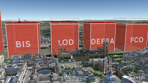
Carbon dioxide emissions (including targets and savings) from UK Government departments. Left to right: Department for Business, Innovation and Skills; Law Officers' Department; Department for Environment, Food and Rural Affairs; Foreign and Commonwealth Office. For more information see: The Carbon Quilt Blog.
A short animation shows global carbon dioxide emissions in real time using the volume o the UN building as a unit of comparison
The volume of one tonne of carbon dioxide gas
One of my more concrete carbon visualisations. This cube in Stoke Newington School, London is 8.12 metres tall and takes up the same volume as 1 tonne of carbon dioxde gas at atmospheric pressure and 15 °C. It is used as a platform by both art and science teachers for projects about climate change.
NOT a concrete visualisation
By way of contrast here is an abstract visualisation. Two bubble maps show the carbon dioxide emitted into the atmosphere by different countries. Left - cumulative emissions since 1751; right - emissions in 2006. The two diagrams are to scale. The colours of the circles indicate membership of the G20. Data source: CDIAC, doi10.3334/CDIAC/00001 There are interactive versions (which show all countries) of each of these bubble maps here:carbonquilt.org/gallery/interactive. The chart is discussed in this blog post: carbonquilt.posterous.com/who-should-pay-for-climate-change.
For many more concrete visualisations of greenhouse gases see Carbon Visuals Work. To make your own visualisations see Carbon Quilt.
Ostensive definition 2: Concrete visualisation is what Chris Jordan does when, with his huge images, he makes large numbers tangible
Ostensive definition 3: Examples of 'using the world itself as its own explanation'
Left all the water in the world (1.4087 billion cubic kilometres) including sea water, ice, lakes, rivers, ground water, clouds. Right All the air in the atmosphere (5140 trillion tonnes) gathered into a ball at sea-level density.
Just two data points are visualised: 1.4087 billion cubic kilometres of water and 5,140 trillion tonnes of air, which would not warrant graphical representation at all if we were visualising them abstractly. Nevertheless, although the image is impoverished from the point of view of ‘data density’ visualising these data concretely provides a new kind of quantitative insight into the world.
It is interesting to note how and why the image works. It is not just visual familiarity with the globe that provides a sense of scale; it is also viewers’ experience of travel. Being able to relate the diameters of the spheres to journeys one has actually made gives another dimension to viewers’ understanding of the quantities involved. For this reason, I made two additional versions – one centred on North America and one centred on Asia – to help non-Europeans/Africans relate to the image directly (above).
Land-cover Islands
If you collected together all the land that was desert, all the land that was grassland, forest, cropland, etc. and gave each type of land cover an island of its own, this is how those islands could appear. Note how small the 'urban' island is, yet it is home to over 50% of humans. The table is an adequate summary of the data but seeing continent sized islands gives us something that anyone who is familiar with the globe can relate to in a physical as well as numerical way. Data: IIASA
My new show opened today in the White Space Gallery, Axminster. Here's the blurb from the poster:
In Here we are Adam Nieman sets out to connect the White Space Gallery to the rest of the universe. Nieman's mathematically precise work expands our experience beyond the everyday 'human scale'. There is plenty going on beyond our local horizon, or at a finer resolution than we can perceive directly, or on a numerical scale we usually only relate to abstractly. Here we are makes this expanded scale accessible.
The centrepiece is an installation called Wall to Coast, which aims to extend the walls of the gallery all the way to the sea and beyond. Gallery space usually works as a ‘bubble’ – it is separate and cut-off from the outside world. Just for fun I wanted to do the opposite – to transform the gallery into an instrument for connecting a viewer to the rest of the world. The installation also includes equidistant azimuthal maps centred on the gallery, Google Earth imagery, photos and found objects from the four patches of coast.
Here we are being hung. In the centre are the maps from the Wall to coast installation. At the end is The air above - a map of the air above the gallery to the edge of space on the same scale as an OS map (50,000:1)
Video from one of the walls of the gallery
There are also two new versions of Allotment, which shows what we’d each get if we shared the world out fairly (which I’ve described before). It has been revised for a new population (these days we each have just 5.4 acres, not 5.7 acres) and now there is a 1:250 scale version, with 59 trees (our allotment of trees).
Allotment (1:250 scale) digital print on Dibond, metal figure, model trees 138 x 86 cmCaption: If we divided the surface of the Earth equally between its 6,871 million human inhabitants we would each have an area of land 21,663 m2 (5.4 acres). We would have approximately 59 trees each. This is our allotment, separated into areas of different land use. (To get a sense of scale, check out the figure standing on the 'Urban' patch, which is 7m x 7m.)
As ever, air features heavily in the show. I continue to try to visualise the concentration of carbon dioxide in the atmosphere. It's something I think we should try to get a 'feel' for as well as understand numerically. I made a big picture of a tiny cube of air at sea-level pressure. The cube is 89 nanometres tall (about the size of a flu virus) and contains 17,699 air particles. The 5 blue circled particles and 2 red circled particles are carbon dioxide molecules (the others are mostly nitrogen & oxygen). Red circles indicate carbon dioxide from human activity. These few circled particles have major impact on life on Earth. Without them, all plants would die and the surface of the Earth would be frozen. Carbon dioxide is potent. The red-circled particles are changing the World’s climate. The picture is accompanied by a video (below).
392 parts per million
80cm x 60 cm Digital print on Dibond plus video (Edition of 20)
17,699 air particles. The 5 blue circled particles and 2 red circled particles are carbon dioxide molecules
The gas within
Another carbon dioxide piece, The gas within, consist of an acrylic tube divided into 2 volumes. The whole tube represents the volume of pure cabon dioxide in the air in the gallery (assuming a concentration of 392 parts per million). The larger volume (23 litres) is the 'natural' carbon dioxide - the stuff that would be there anyway. The smaller volume (9 litres) is the anthropogenic (man-made) carbon dioxide. The dimensions of the room are 6.7 x 4.4 x 2.8 metres.
Not nothing
Another new air piece, 'Not nothing', consists only of the air in the gallery and some calculations on a couple sheets of paper. It points out "this is not an empty room - it's full of air". I worked out that there are 2,063 trillion trillion air molecules in the small volume defined by the gallery. They collide every 14 billionths of a second on average, which means there are 15 trillion trillion trillion collisions every second.
Yes - the numbers get silly and I usually try to avoid that, but I think it works in context. I tried to find some sort of handle on the numbers and chose icing sugar as a comparison. We can just about perceive icing sugar as a collection of particles rather than a continuous substance. A breath-full of air contains as many particles as there are grains of icing sugar in a cube of icing sugar 650 metres high (about 12 billion trillion).
There are other startling results from the simple calculations. For instance, the total distance travelled by the air molecules in the gallery every second is 108 trillion lightyears. That means that they cover the distance to the edge of the visible universe and back nearly 4,000 times a second. (The delightful fact that air travels huge cumulative distances was pointed out to me by my friend Ben Craven.)
London's green and pleasant land
60cm x 26cm (Edition of 20)
One of the prettiest pictures in the show is Green London. It's simply a map of London that shows only the green bits and water. For many of my pictures you have to love numbers before you can see how pretty they are, but some including Allotment (1:400) and Orbits are intrinsically pretty. I have Allotment on my bathroom wall!
Orbits
80cm x 60cm (Edition of 20)
The orbits of the planets (and Pluto) to scale
One piece that didn't make it into the show is Life Changes, which aims to mark every birth and death around the world live in real-time. I just haven't had time to make it work. I had also hoped to have a first sketch for my plan to make a portrait of everybody on Earth but, again, I haven't had enough time to experiment and there are some technical as well as visual challenges with making it work.
Digital sketch for Life Changes
There are 18 pieces that did make it into the show. Do check it out if you find yourself near East Devon. For some of my other work see: www.zangtumbtumb.com/adam
I’m a climate change sceptic. There - I’ve said it. It’s true - I am sceptical about claims made about climate models and about the data on which they are based. On the other hand, I am very confident that the models are right (within their own error bounds) and that data on which they are based is good. There’s no inconstancy between scepticism and confidence – they are entirely compatible. Indeed, belief in the science of climate change would not be a ‘scientific’ belief if it were not also sceptical. (The reason we can be so confident is a topic for a future post. Today I’m focusing on semantics.)
The trouble is, the term ‘sceptic’ has taken on a new meaning in relation to climate change. It still carries positive, sciencey connotations but the word has become attached exclusively to people without confidence in climate science. ‘Climate sceptic’ has come to mean someone who believes climate science to be bunk – not someone who goes along with it sceptically. A ‘climate change sceptic’ is a science sceptic rather than a sceptical scientist. For sceptical scientists (‘real’ sceptics) it’s irksome in the extreme to have the term appropriated by the opposition. “They are not ‘sceptics’ so much as ‘cynics’ or ‘deniers’” we say.
And here’s where it gets messy. We are wont to call them deniers because this term carries negative connotations of holocaust deniers motivated by fascism, and that’s just rude. On the other hand, the term diffuses the positive connotations carried by the word ‘sceptic’ that we believe properly belong to our side of the debate: rationalism, the enlightenment, science, etc. There are few viable alternative ways to label the two sides in this particular dispute. Most of the names we can come up with will have pejorative connotations for one side or the other. ‘dangerous wishful-thinking morons’ is how I’m tempted to describe the opposition, but that would not help the debate.
Does it matter? It’s just words isn’t it?
Merely being right about climate change is not enough. Being right is not sufficient to win the argument – it’s not even necessary – but winning the argument is vital because the stakes are so high. Unless hundreds of millions of people understand the threat, billions of people will die. Winning the argument is more important even than reducing greenhouse gas emissions because it is a pre-requisite for any reduction. So-called-sceptics are enjoying a huge ascendency at the moment and it is they who appear most open-minded and rational to people who are currently unaligned. How have they pulled this off? Just words. (The way it works is what semioticians would call ‘second order signification’ but that’s not important right now. The bottom line is that words are more important than greenhouse gases.)
So it makes a difference what we call things. ‘Climate war’ is another problematic term in common use. Is this a ‘climate war’? You are in a large building when a fire starts. You realise that everyone should get to the South exit but others believe it would be better to head for the North exit. They are wrong, and they are dangerous and obstructive, but are they an enemy we should go to war with? In the middle of a crisis, the last thing you need is a war. The climate ‘debate’ is not a war, it’s an argument that can’t be lost – the distinction is important.
I will make this point more emphatically: Don’t go to war with climate change deniers. It’s not a quick way to win the argument. It will destroy the rational basis for action on climate change because upon the declaration of war the notion of a ‘disinterested’ position evaporates and ‘us’ vs ‘them’ predominates (at which point the BBC would be right to seek to ‘balance’ every call for action on climate change with someone who claimed that climate change was not happening). Being right counts for nothing when you are at war. We (confident sceptics) could not win a war, which is why we have to win the argument. Arguments about climate science must remain disinterested or they cease to be science.
Leadership
In our burning building how do we convince the unaligned to follow us South and how do we show the ‘North-sayers’ the error of their ways? (The analogy with climate change is very loose by the way, but stick with it.) The path of quick leadership is to shout very loud and sound very confident about what you are shouting. The path of slow leadership is to help people lead themselves out of danger – to have their own sense of the right direction, not just a sense of who to follow. Both the North-sayers and the South-sayers will try both approaches.
In relation to climate change, these are the options:
What to do
How to do it
Help people to lead themselves out of danger
·Help people to understand the threat by understanding the science
·Help people to understand why they can be confident in the science (and a lot less confident about alternatives)
Get people who can’t or won’t lead themselves to trust your judgment
·Spell out the threat
·Explain why you have confidence that the threat is real
·Explain why you have confidence that your proposed action will be efficacious
Avoid war at all costs (see above)
·Never sacrifice a disinterested position in favour of an aligned one, however expedient it seems at the time.
Whether you want to lead by helping people to lead themselves or lead by creating trust, the absolutely key part is explaining why you can be confident. Understanding where the confidence comes from – why scientific consensus provides us with reliable knowledge even though it is contingent knowledge – is more important that understanding the science of climate change. It is not just a bit more important, it is much more important than understanding the greenhouse effect, etc. when it comes to winning the argument and allowing us to act on climate change.
The problem we face is that the source of the confidence is really poorly understood. Ironically, scientists themselves are especially confused about what makes scientific knowledge reliable. (Scientists understand ‘nature’ not ‘science’. Once scientists have assured themselves that scientific knowledge is reliable they don’t spend a lot of time wondering why it is reliable - they leave that to philosophers. Individual scientists know why they can trust scientific knowledge but not why the rest of us should.)
Confidence in climate science is a topic for another time. The point here is:
·Words are more important than greenhouse gases (because they are a pre-requisite for reducing them)
·Explaining why you have confidence in climate science is more important than explaining climate science
·The climate ‘debate’ is not a war, it’s an argument that can not be lost
·If the climate debate becomes a war, climate change deniers will win
In How much oil is gushing from BP's Deepwater Horizon rig? And what does that mean? I was looking for a more intuitive way to think about quantities of oil and rates of emission. The conclusion was that, in many contexts, area is a better way to think about oil than volume. Nevertheless, I wanted a better feel for the rate at which BP is polluting the Gulf (a good estimate of the rate, that is) so I made this animation for Carbon Visuals:
The volume that would accrue over a day at the rate in the video
The motivation for making such an animation is to understand the numbers better - to get a handle on what's happening. The animation is ingenuous - not polemical. In an ideal world, BP itself would have made a movie like this as a way of presenting the facts of the disaster in an intuitive way.
I'm not in the business of bashing BP, though I think that any corporation should be challenged when its public relations efforts are disingenuous and BP's certainly have been. They have systematically understated the rate of emission and Tony Hayward, the Chief Executive Officer of BP used a remarkably inappropriate comparison when he pointed out:
"The Gulf of Mexico is a very big ocean... The volume of oil and dispersant we are putting into it is tiny in relation to the total water volume."
Cubic metre for cubic metre he's right, but it's an odd point to make about a hydrophobic substance like oil. Oil affects areas, not volumes (as I discussed before).
Now there is even more spin from BP. In a 'technical update' on 24 May 2010, Kent Wells (Senior Vice President of Exploration and Production at BP) used the following graph (4' 13" into the video) showing the oil BP has managed to remove from the sea:
It looks good, doesn't it? It looks like an improving situation. As Wells himself says:
"...and here you can see how we've continued to ramp up" (4' 45")
I would guess that a majority of people seeing the graph in the context of the presentation would come to the conclusion that each day BP are collecting more oil than the day before. In fact the graph shows that the rate of collection has been going down - but you have to be pretty good at looking at graphs to see that even though the graph states clearly that it is a 'cumulative' graph. (Some oil is collected every day, so the cumulative total always goes up even if the daily amount goes down.) I expect a PR person at BP was delighted with this cunning ruse. It's not a lie. All you have to do to make the majority of your audience believe a bad story is a good one is use an apparently straightforward graph that is actually quite a subtle graph. For the numerate portion of the audience though it just makes BP look like a bunch of shysters - it's a PR disaster.
It's a shame really. The graphics in that technical update are rather nice. BP have clearly got a good team working on presenting the 'facts'. Nevertheless, we will never be able to trust corporate communications implicitly. Facts will always be framed by a corporation's agenda so there's always going to be a role for outsiders to challenge and re-present the facts.
I'm rather pleased with the animation. OK - Industrial Light and Magic or Double Negative might have made it prettier and there are a few rough edges I haven't had time to fix, but it does the job. It is also the very first thing I've made with Blender. I'm very impressed with Blender's ability to simulate liquids and look forward to seeing what else I can make. The animation is greatly enhanced by a soundtrack by GoveEd's Ben Lavington Martin. (30 May 2010: Actually - there are big problems with the animation. It looks as if there is a 'drain' i.e. it looks as if not all the liquid entering the imaginary box is staying there. It think this is an artefact of the perpective, but I'm not sure yet that it's not a Blender problem. Also, 30 seconds is too short to give a good sense of the rate, but it's all I could manage with my wee compter.)
My previous post quantified the oii spewing from BP's Deepwater Horizon well. It didn't mention the 11 men killed when the platform blew up. This article remembers them. In the pictures I make - pictures of numbers - there is room for only one real person: the viewer. I try to make statistics meaningful in part so people can realise how impoverished they are - that's sort of the point. Any good statistician would do the same (not that I'm a good statistician).
The events in the Gulf of Mexico have reminded me of the Piper Alpha disaster. I was a student in Edinburgh (Scotland) at the time. The Piper Alpha disaster pretty much passed me by, but in Edinburgh, as in most cities in the time of Margaret Thatcher, there were many homeless people on the streets. One particularly pathetic beggar would hang out near a theatre I used to frequent. He came to be quite familiar to me.
A couple of years after the disaster I caught a documentary on TV which included first hand accounts of people who'd been on the Piper Alpha platform - people who'd seen their friends burn to death and expected the same would happen to them. The friendly beggar I'd come to know - and despise - was there. His dignified testimony revealed far more to me than the incompetence of Occidental. The programme didn't address what happened to the survivors, but anyone in Edinburgh could see for themselves.
We can choose when to see the world statistically and when to see real people. Corporations can't. Think about that. BP cannot see the men it killed nor the marine environments it's destroying. It knows they are dead and dying but it can't know what that means - it's a corporation.
Estimates vary for the amount of oil escaping from BP's Deepwater Horizon rig. BP's own estimate is 5,000 barrels a day but no independent estimate is less than 20,000 barrels a day. According to an article by Alan Foljambe independent estimates are converging on 70,000 barrels per day. Wow! That sounds like a lot - but how much? Not many people have a good sense of scale for quantities like that.
Would it help to think about it as a continuous volume instead of a discrete number of barrels? It turns out that 70,000 barrels is 11,130 m3. It would fill 4.5 Olympic swimming pools a day or a cube over 22 metres tall (see picture). It is 129 litres per second.
This volume of oil is escaping from the Deepwater Horizon well every day
But volume is not a good measure. Oil spills devastate areas, not volumes. What works better (for me at least) is to imagine a layer of oil 1 mm thick. That's plenty thick enough to kill anything it coated. Imagine walking through a puddle 1 mm thick - it would be slippery and you'd make schlopp sclopp noises as you walked. So - how much oil is spewing from the rig if we think of it as a 1 mm thick layer?
It's 129 m2 per second.
It's a 13 metre wide puddle of oil every second
It would cover an area the size of Hyde Park and Kensington Gardens (London) in 5 hours
It would cover an area the size of Central Park (NYC) in 7 hours
It would cover the whole of Manhattan in 5 days
It would cover Rhode Island in 40 weeks
It would cover Wales in 5 years - that's one μWales (a 'micro-Wales') every 2 days
(For those not familiar with the units, a μWales is one millionth of the area of Wales. It's about 2 hectares or 5 acres)
Oil from the Deepwater Horizon would cover Hyde Park & Kensington Gardens (left) in 5 hours and Central Park (right) in 7 hours
70,000 barrels per day is equivalent to a puddle 1mm deep and 12.8 metres across every second
It makes a difference if you can relate quantities a) to you your own body; b) to things you know. I know Hyde Park well and Central Park a bit. They are very special places, but not intrinsically more special than the areas of coastline under threat, nor even the marine ecosystems being destroyed. One reason the 'Hyde Park' and the 'Wales' are good units of area - better than the hectare or square kilometre - is that they remind you that it is not a mathematical quantity being covered in oil, but a precious eco-system.
A Cabinet meeting costs £10 per minute - and that's just the politicians, biscuits are extra!
My calculation also reveals that the recent cut in ministers' salaries isn't quite as impressive as it sounded at first. The cost of the Cabinet's politicians has been reduced from £10.44 to £10.09 per minute - a reduction of 3.5%. I expect the cuts imposed on the rest of us will be a little more substantial.